


overview
Desiring God's brand identity is built for clarity — clean typography, restrained color, and a system that keeps focus on the mission.
16Core Assets
04sub-brands
08system colors
03type families
01 / brand identity
Main Lockups
The primary Desiring God lockups pair the arrow mark with the wordmark. Use the horizontal lockup wherever space allows; the icon and stacked forms cover tight or square placements.













02 / Sub-brands
Brand Structure
Desiring God is the parent brand. Four sub-brands — Ask Pastor John, Look at the Book, Solid Joys, and Light + Truth — sit beneath it, each with its own mark but sharing the same typographic and color system.


Ask Pastor John

Look at the Book

Solid Joys

Light + Truth






Solid Joys - Underlined

Solid Joys - Underlined Dark Mode






03 / Type + color
Type + Color
Balto carries the voice; Merriweather adds warmth for long-form reading. Color is deliberately restrained: black, white, and a family of neutrals do the work, with Scarlett reserved for signal.
1/2
Balto
Primary typeface
BaltoBalto serves as the primary typeface for the Desiring God brand, carrying its identity consistently across every medium the ministry publishes in — from the website and articles to video titling, social graphics, and print materials. As a gothic sans-serif with eight weights and matching italics, it's confident and approachable rather than cold or corporate, and flexible enough to carry a bold sermon title, body text, or a social caption.60pxExalt God Above All
42pxExalt God Above All
30pxExalt God Above All
27pxExalt God Above All
Licensed for Desiring God through Adobe Fonts. The OTF pack is for staff and approved vendors.
Download OTF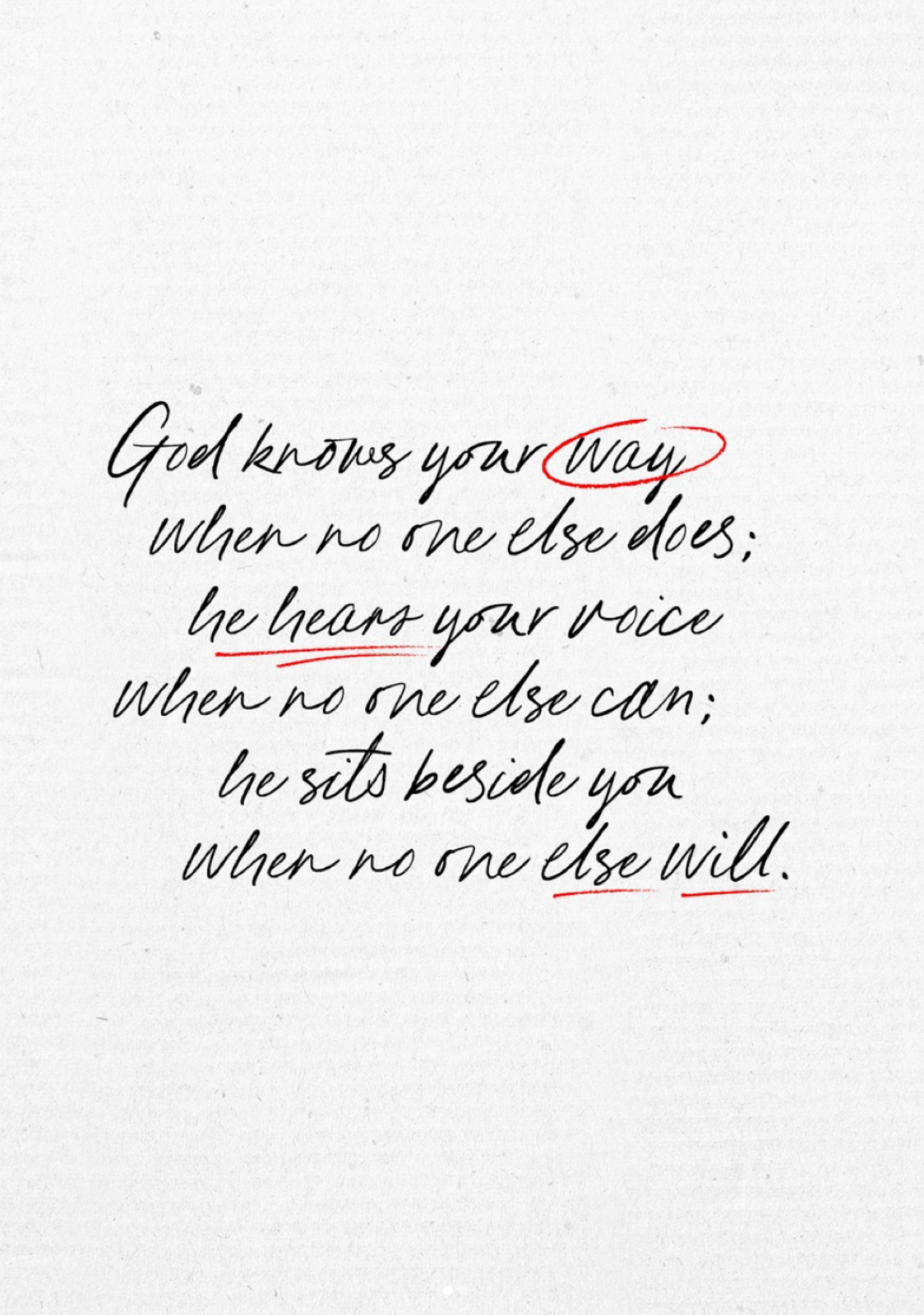
social media
Social Typefaces
While the brand uses three typefaces for official brand design, social media draws on a handful of other typefaces for handwriting, variation and texture.
website
Web Type Treatment
Discover how Balto + Merriweather are to be used in a web context.
typeface
Exalt God
 Click swatch to copy hex code
color composition strategy
Signal,nevernoise.
Neutral foundations do most of the work. Secondary neutrals build depth; accents identify moments.
75%neutral Foundation
legibility
Contrast determines whether text is actually readable, not just visually present. We test every brand color against white and black text using the WCAG luminance formula. Normal text needs a ratio of at least 4.5:1; large text (18pt and above) needs at least 3:1.
 Large & Normal Pass
 Large Passes, Normal Fails Large & Normal Fail
Pure White#ffffff
1.00:1
21.00:1
1.00:1
Bone#f5f5f5
1.09:1
19.26:1
1.09:1
Fog#dcdcdc
1.37:1
15.31:1
1.37:1
Slate#3f4447
9.86:1
2.13:1
9.86:1
Graphite#231f20
16.30:1
1.29:1
16.30:1
Onyx#101011
19.02:1
1.10:1
19.02:1
Pure Black#000000
21.00:1
1.00:1
21.00:1
Scarlett#c6000e
6.16:1
3.41:1
6.16:1
Click swatch to copy hex code
color in action
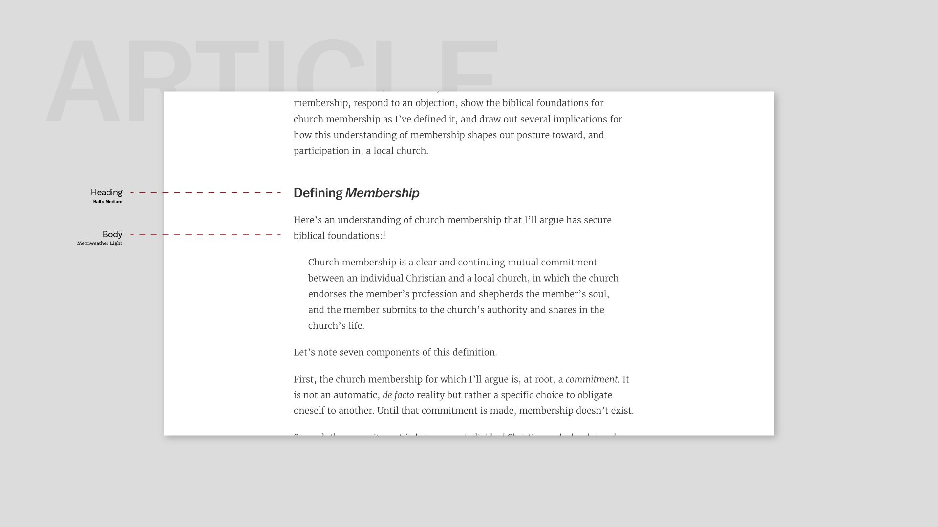
Color distribution
Website
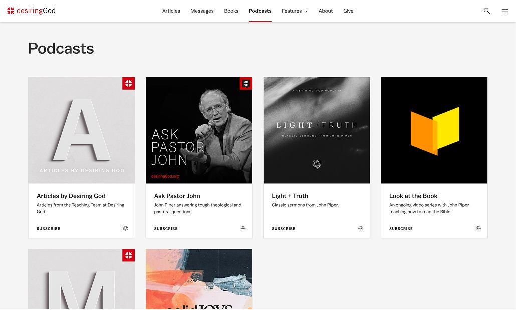
Shades of white and black do the heavy lifting across the website, while red shows up sparingly in the form of logo marks, active tab underline, buttons + links, etc.
Color distribution
Social Media
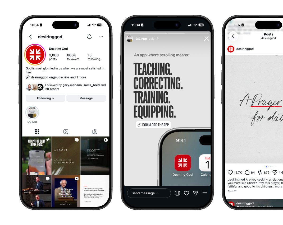
Instagram posts stay black and white with type carrying the message. The Scarlett mark is the only colour on the grid, so it reads as the signature.
Color distribution
Single Color Logo
Here you see the usage of a single-colour lockup (white) for video animation: on footage or a dark field the mark needs no colour to be recognised.

Color distribution
Social Media
Stories and quote cards set Scripture in Balto on Bone or Graphite grounds. Scarlett appears once, in the mark or an underline, never as a background.
Color distribution
Desiring God App
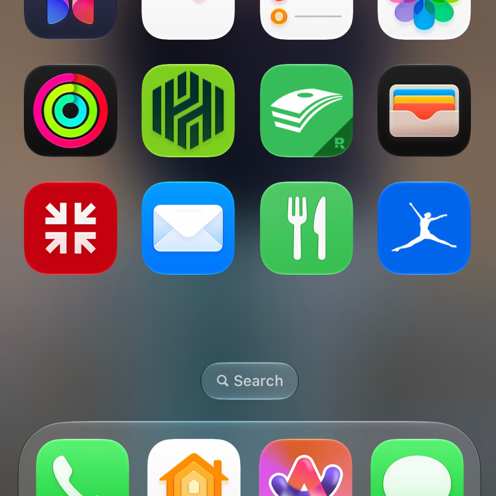
The app follows the website: white and Graphite surfaces, Balto for headings, Merriweather for reading, and Scarlett kept for the mark and the active state.
Color distribution
Video
In video the single-colour lockup carries the brand: white on footage or a dark field, animated in, then held still for the closing frame.
04 / size + space
Size + Space
Give the mark room to breathe and never let it shrink past the point of legibility. The clear-space unit is the height of the arrow mark itself; the minimums below are the smallest sizes the lockup and icon may be reproduced at.
Margins
Keep a clear space of at least one mark-height (1x) on every side of the lockup. Nothing — type, imagery, or other marks — should enter this zone.








minimum size requirements
Below these sizes the counters close up and the wordmark loses definition. Use the icon alone when the lockup would need to be smaller.
Digital
140px
20px
35mm / 1.4in
5mm / .2in
margins
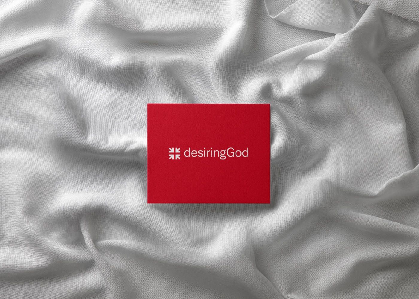
Postcard
A printed piece with the lockup held to its clear space: at least one mark-height of empty ground on every side, even on a card this small.
sizing
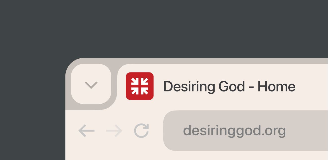
Favicon
At favicon and app-icon sizes the wordmark is dropped and the arrow mark stands alone, on Scarlett or white, so it stays legible at 20px.
05 / examples
In the Field
The system at work across the ministry's channels: social, web, print, video, email, and books. These are reference points for tone and proportion, not templates to copy.
social media
Reel Design
Vertical reels lead with one line of Scripture or a John Piper quote set large in Balto over quiet footage. The mark holds a corner and nothing competes with the words.
brand design
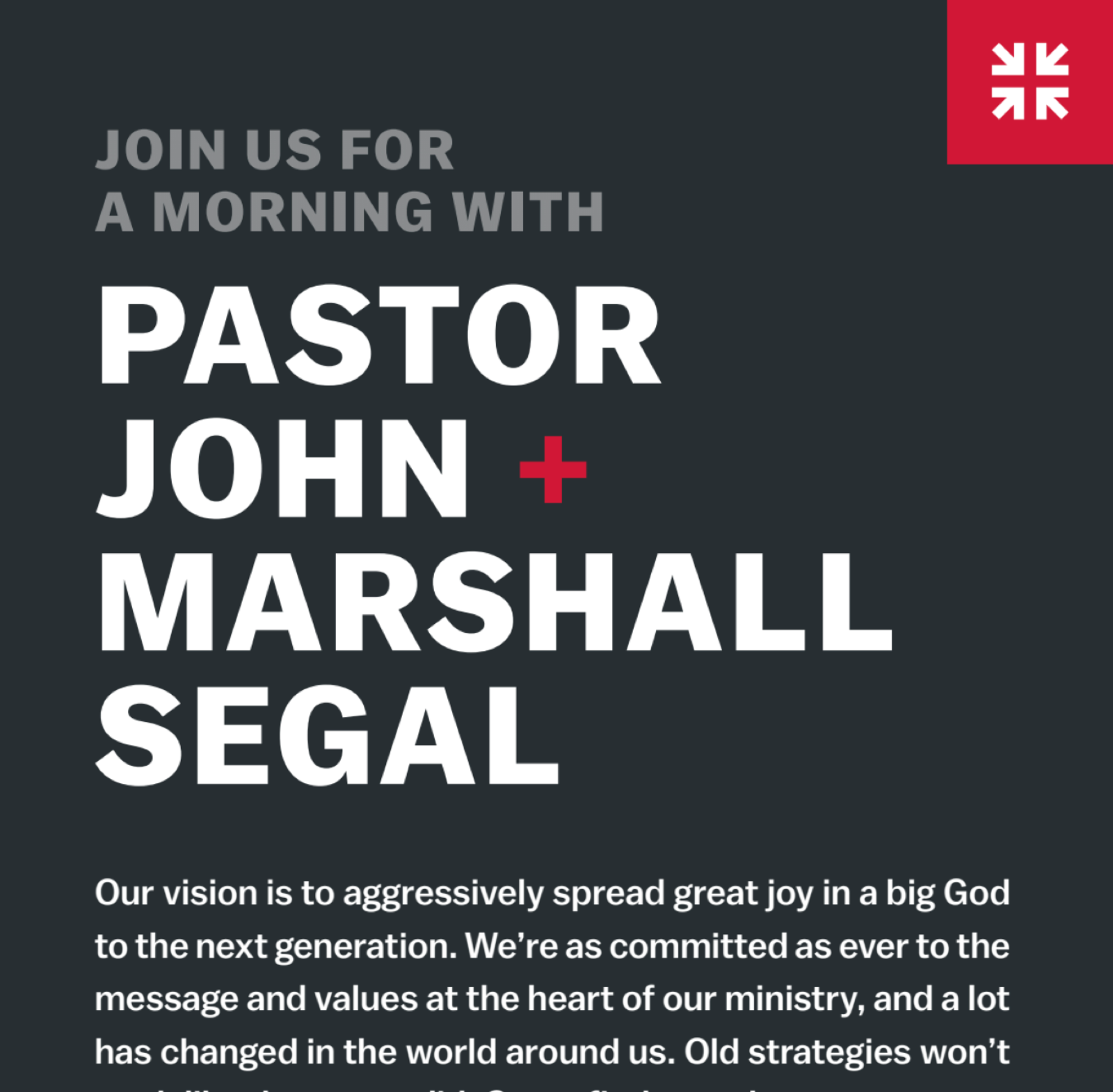
Web UI
desiringGod.org is almost entirely black and white so articles, sermons and the daily devotional carry the page. Scarlett marks the active tab, links and buttons, nothing more.
brand design
Print Design
Event and conference pieces sit on a dark ground with Balto set tight and large. One Scarlett accent is enough; the type does the rest.

brand design
Email Header
Email headers use a single Scarlett field with the headline in white Balto. The body below stays on white, so the header does all the signalling.
brand design
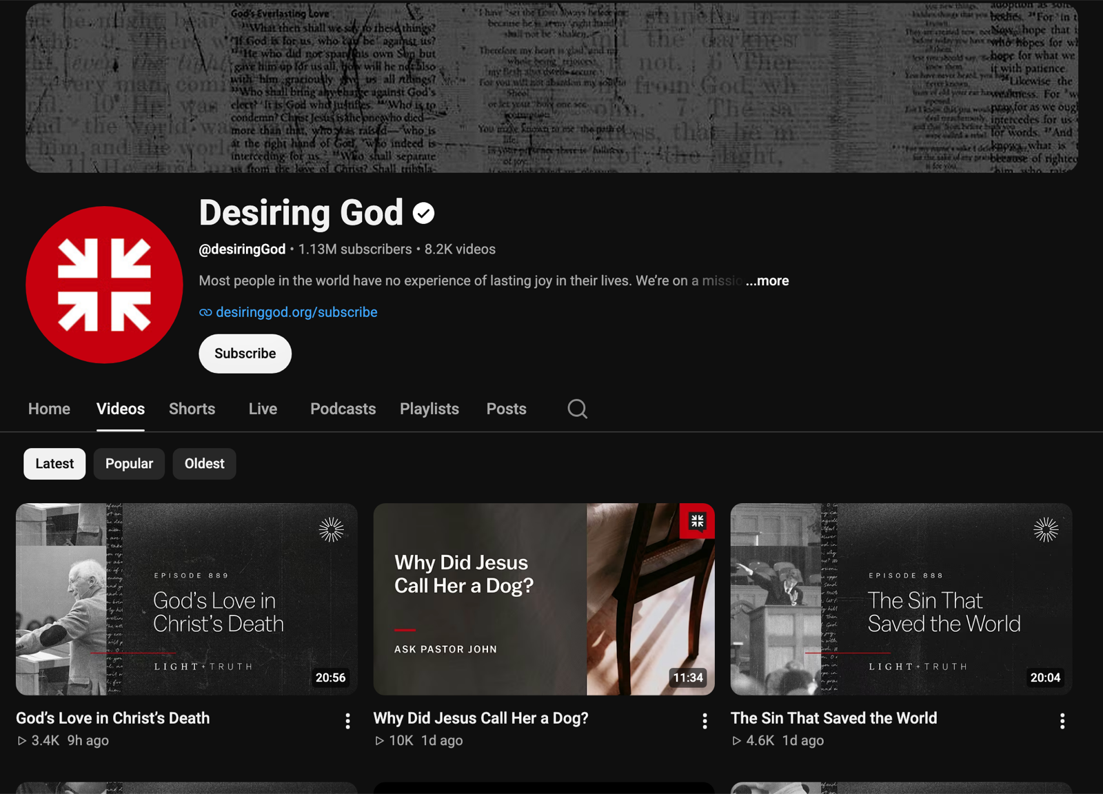
Video Thumbnails
Sermon and Ask Pastor John thumbnails: one face or one line, generous clear space, and the mark small and in the same corner every time so the channel reads as one series.
brand design
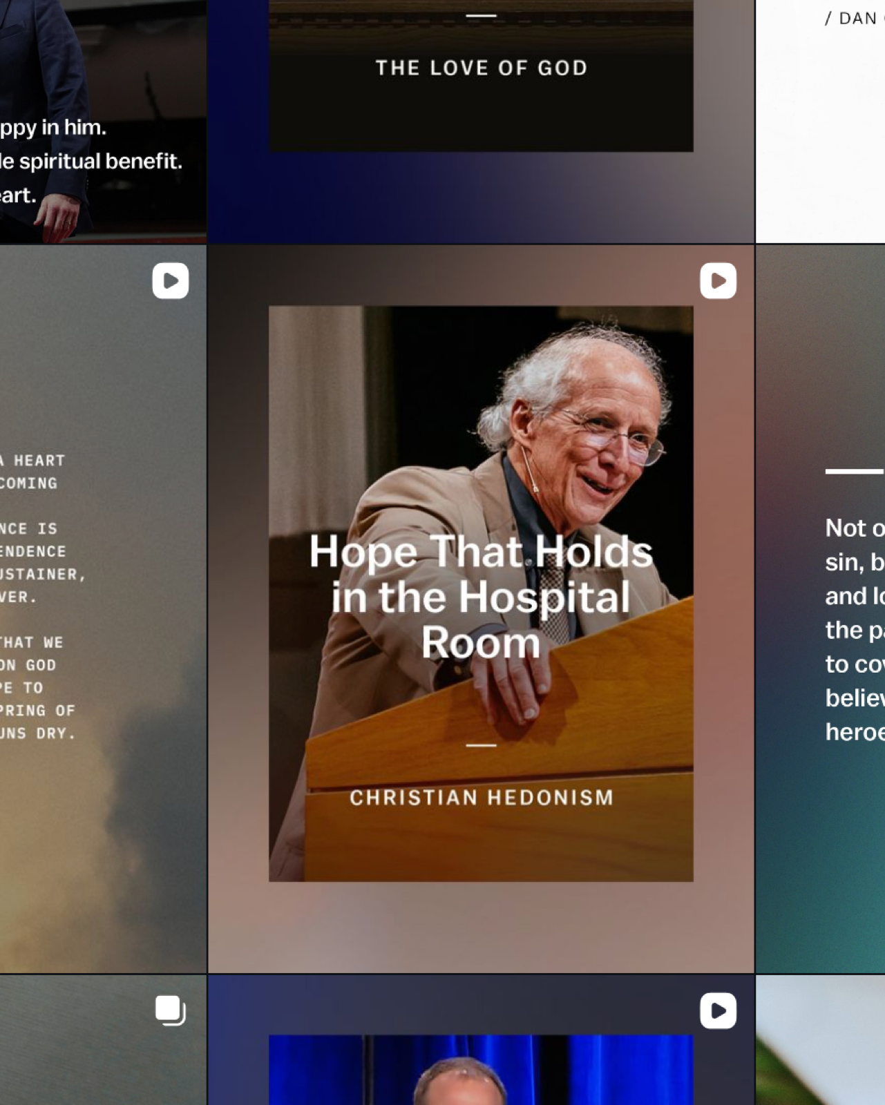
Reel Thumbnails
Reel covers share a single template so the grid reads as one set: episode title in Balto, a muted photographic ground, and the mark held to the clear-space rule.
brand design
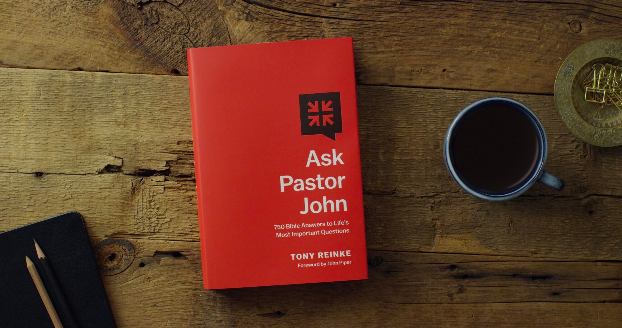
Book Design
Books lead with the title in Balto on a solid field, the sub-brand mark where one applies, and the arrow mark small on the spine and back. Ask Pastor John: 750 Bible Answers to Life's Most Important Questions shows the pattern.
06 / finder
File Library
Every asset in the system, organised the way the brand is. Open a folder, pick a file to preview it, and download a single file or a whole kit.
List viewfile preview

 Desiring GodDownload KitMain LockupsFull Color
 Main Logo


















































 Single ColorTypefacesSans Serif
 MerriweatherAsk Pastor JohnDownload KitLook at the BookDownload KitSolid JoysDownload KitLight + TruthDownload Kit